Creative Process: Constraints
I hate making decisions. Frequently! I think DH thinks I play a game when he asks me what I want for dinner and I tell him “I don’t know.” In reality, by the time we get to dinner I’ve probably already made at the very least a dozen design or marketing decisions and I just cannot make any more. If I’m given a few choices from which to choose rather than given a wide open question I am then usually able to pick. I find the same tactic can be really helpful when designing or even in my photography.
Have you ever been given a large, but vague task and found yourself almost paralyzed by the infinite possibilities that lie in front of you? This can be the case when designing knitting patterns. Especially if something hasn’t directly sparked an idea or you aren’t working towards a specified theme. Just think of the number of questions there are:
- What weight yarn do I want to work with?
- What fiber types do I want? Wool? A Blend?
- Do I want singles yarn? Plied? Tightly spun and plied for a smooshy feel? Worsted spun or woolen?
- What kind of stitch pattern do I want? Cables? Lace? Twisted? Slipped? Brocade?
- What sort of fit do I want? Highly fitted? Loosely fitted? No shaping?
- How much ease do I want? Negative? Zero? Positive? Oversized?
- Do I want to knit it top-down or bottom-up?
- What kind of neckline or cuff do I want?
- Do I want seamless or seamed?
- How many sizes do I want to offer? Over what range of sizes?
- Do I want to appeal to men or women or both?
- Do I want it to be an easy knit? Or a challenge? Or in the middle?
- and the list goes on and on and on…
In reality, once you answer a few of those questions some of the others have answers fall right into place. But I do enjoy designing to a requirement of some sort, be it a theme such as for a sock club, a magazine’s call for submission mood boards, needing to use a specific yarn and/or color and so on. It just helps direct my thought processes. Some of my favorite designs were designed for specific needs.
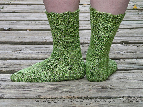
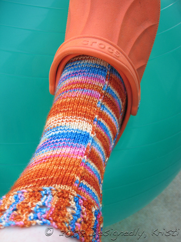
Siren Socks (shown at top) were requested to be similar to Spearfish. I was given a wool and seacell blend yarn to work with and the club colorway (not what I knit my version with) was sea related. So, I adopted an oceanic theme and ran with it.
Mashup Madness came about because the constraint for the first Sock Madness pattern call was that the name had to include “madness” in the title. I had recently been drawn to the cable pattern that has a hint of lace in it and thought “Who put the lace in my cables?” I then couldn’t help but think of those old Reeses commercials that said “Who put the peanut butter in my chocolate? Who put the chocolate in my peanut butter?” I decided I needed the opposite, “Who put the cables in my lace?” represented in the sock as well to complete the design.
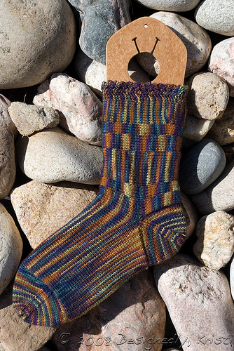
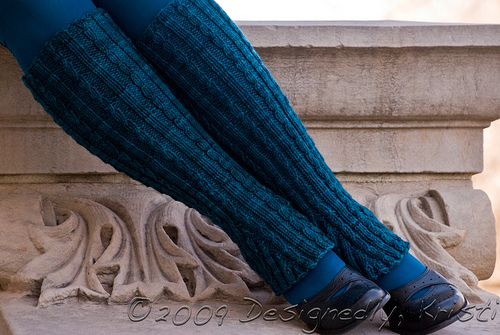
My first Woolgirl sock club pattern was a real challenge because the yarn was super high contrast colors that pooled or flashed at every sock-appropriate gauge I tried. That is hard to design with since pooling and high key colors each tend to drown out any stitch patterns and forget it when they are both present. So, with those constraints I opted to go with an unusual construction technique that showed off the gorgeous yarn rather than try to fight it and Dog Days of Summer was born. This was my first really unique sock pattern and it is still one of my favorites. I haven’t released it outside the club yet because I have been wanting to knit it up in a different, perhaps slightly lower key colorway and include examples of both in the pattern.
The success of that design sparked my proposal for Spread Spectrum (second photo from top) that was published in Knitting Socks with Handpainted Yarns. There are probably at least another half dozen sock pattern ideas in my design notebook that were inspired by these two designs. In fact, once upon a time I entertained the idea of writing a full book working only with high contrast handpainted yarns. Not just for socks either! Perhaps some day.
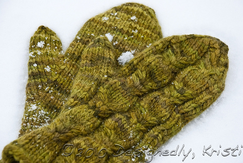
The constraints that can help me push through the paralysis of too many options isn’t always so obviously a part of the design. I’m finding that designing for the My Sister Knits newsletters to be an enjoyable challenge because I have to use a yarn they carry (obviously) and it has to be a pattern that can be presented on a single page. That forces me to keep things simple which is a valuable exercise for me since I always like to learn something new with everything I knit. That approach tends to make for challenging patterns that not everyone is up for. Often times I try to make the MSK projects with one skein and minimize the left overs whenever possible or offer a way to make use of them afterward. Some of my favorites from the MSK patterns include Collegiate Flare (above), Laridae Mittens (third photo from top) and of course Stellar Facecloths.
If I’m not currently working under any design constraints and finding myself stuck sometimes I’ll revisit a prior theme I’ve worked with before and either re-work it or work with something related. Other times I’ll seek input from family and friends. Or occasionally I’ll employ Oblique Strategies.
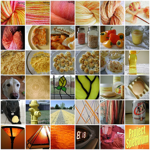
As I mentioned at the beginning of the post, I use constraints with photography too. If I’m feeling stuck or uninspired I’ll find a theme to work in. I think that was why the first round of Project Spectrum did so much to further my photography skills several years ago. I had a goal and a purpose to take pictures beyond just sharing my knitting on my blog. I think that was kind of the turning point for me and photography. If your friends and family don’t inspire a theme for your photography, Digital Photography School has a challenge each week that you will likely find educational.
Do you like working with some set limits or specific goals like me or do you prefer to have wide open possibilities?