An Introduction to Color Theory
Note: It is important to note that dealing with color on the computer screen is quite different than dealing with it in paint, markers, crayons, pastels, pencils etc. There is a limit to the number of colors that can be represented accuratly on a computer monitor and each monitor will desplay colors differently. On that note, please do not take these graphics as the definitive in color theory, but rather as a crude example that is not real accurate in the world of artistic mediums. I hope you find these examples helpful to you in understanding color and how to use it.
Color Schemes
Harmony, according to Webster's Dictionary is a "pleasing or congruent arrangement of parts." This can be applied to many areas of art, from poetry to music to what we are talking about tonight - color. There are some tried and true recipes for color harmony that I'll present to you.
One of the simpler color schemes is monochromatic. This would be using the colors that all are in the same tonal family. In this situation you would use contrasts between tints and shades of the same base hue without changing tones to add visual interest to a piece of art. Ironically, for many people this can be one of the harder schemes to work with in it's purest form. The result is simple and without discord so focal points may not stand out as much as in other color schemes. Contrast in saturation and brightness takes a prominence. Typically one shade or tint will dominate a piece. Often white or black is also used in such a scheme to provide the needed contrast.
 Here are some examples of monochromatic color schemes. Usually one value dominates a piece and some white and black are also used to increase the contrast. |
Another color scheme is the analogous scheme. This involves using colors whose hues are in sequence on the color wheel. Sometimes this scheme is mistaken as a monochromatic scheme if the colors are very similar in hue. This is usually the most used type of color scheme because it feels "safe" to most people.
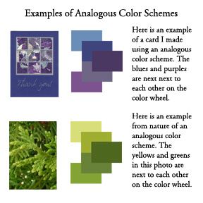 Here are some examples of analogous color schemes in use. As with the monochromatic schedme, usually one hue will dominate a composition. |
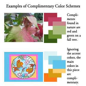
Complementary colors are another common color scheme. Colors directly opposite each other on the color wheel create a maximum contrast and a maximum stability to a piece of art. At the same time, this type of color scheme is not seen often in the stamping world. I think many people are turned off by it and it takes a certain amount of skill or good color sense to pull it off successfully. The cool of blue next to orange intensifies the warmth of the orange and the coolness of the blue. Large areas of complementary colors of the same saturation that touch each can be unsettling, however. Letting one color dominate and separating neighboring areas of similar color with thin lines of white, black or gray can help reduce the discord to a more tolerable level.
|
|
Split complementary colors are a pleasing combination because there is some discord for interest, but it is fairly well balanced. Those that are evenly split are called triads (there are three unused colors between each used one - the primary colors are a triad, as are the secondary colors).
 Here you can see 4 examples of triad color schemes using a color wheel. When using a triad color scheme you do not have to use colors of all one saturation, chroma or tonal value. |
There are also split complementary colors where one hue is chosen and the other two are equidistant from the main hue in each direction. In this case, two of the colors tend to be very similar so more interest can be added by using a darker shade or lighter tint of the two complimentary colors.
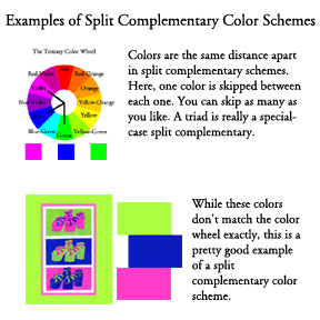 Here is an example of a non-triad split complementary color scheme as determined from a color wheel, as well as in use. |
I didn't include any examples of this, but you can also have an analogous complementary scheme. This is where you have an analogous scheme, but then you add bits of the complimentary color as an accent to a piece. This is really one of the most pleasing combinations.
A common theme through all of these recipes is to let one color dominate the piece of art and use the other colors as a secondary and accent color. As with the split complementary scheme, all of these schemes can use shades or tints of any of the other colors and still be in harmony.
Do you have favorite combinations you like to use over and over in your cards and other art work, but don't know why it works for you? Try reading back through this section and see if you can't figure out what type of color scheme it is - that will tell you why it works.
Color Perception | Tutorial Index | Color Inspiration