An Introduction to Color Theory
Note: It is important to note that dealing with color on the computer screen is quite different than dealing with it in paint, markers, crayons, pastels, pencils etc. There is a limit to the number of colors that can be represented accuratly on a computer monitor and each monitor will desplay colors differently. On that note, please do not take these graphics as the definitive in color theory, but rather as a crude example that is not real accurate in the world of artistic mediums. I hope you find these examples helpful to you in understanding color and how to use it.
Color Perception
Just as the incoming light affects our view of colors, surrounding colors also affect our perception. The affects are all a matter of contrast. I think most people think of contrast in terms of light and dark, but there are many ways to contrast color and that's what we'll be exploring.
Contrast in Hue
Hues are contrasted by the complimentary color. If you recall I said the complimentary color was the one directly opposite on the color wheel. Some examples include blue and orange, green and red, violet and yellow etc. If you don't have a color wheel handy an easy way to determine the complimentary color is to stare at the color for at least 20 seconds and then look at a white area. Because of the way the light interacts with the rods and cones in our eyes you see what is called an after effect on the white that happens to be the opposite color. Give it a try!
When you put equal areas of contrasting color together you can sometimes get what is called "clash." It can cause an unsettling feeling in the viewer and sometimes cause a perceptible vibration when one color is completely surround by it's complementary color (this is especially true when text is placed on a complimentary color background and leads to eye fatigue). This can sometimes be desirable to convey a certain feeling. Adding a thin outline of complimentary color to an object can really make that object "pop" and stand out from the others.
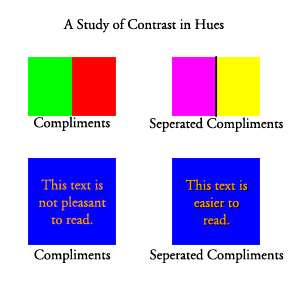 Take note of the "vibrations" you see when complimentary colors are placed directly next to each other. This can be used to advantage in certain situation. Notice the difference when the compliments are sperated by a black line. The vibration effect is reduced, but the colors still pop. |
Contrast in Saturation
If you recall from the previous page, saturation is a measure of the pureness of a hue. When we explore three colors that are identical in all areas except saturation we find an interesting shift that takes place. If you take the middle saturation color and place it in the center of a light and dark saturation you see the middle one looks like two different colors. The middle square in the image below is the same gray in both larger squares, but the one in the darker large square appears lighter than the one in the lighter large square. The bottom example shows how this takes place even with a color. Since the center color connects through both outer colors, if you don't see the sift, try covering one side with a piece of white paper and then switch and cover the other half. You should experience a similar effect as you did with the gray boxes above. This is one of the easier contrasts for us to evaluate because our visual experience is dominated by value.
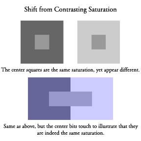 This image explores how color shifting can occur by contrasting saturation. |
Contrast in Chromaticity
This one appears very similar to the saturation experiment. When a middle value is surrounded by a dull color it appears more vibrant and when surrounded by a more vibrant color it appears duller. This one was a little difficult to illustrate with computer colors on the monitor. Again, if you need to, cover one half with a sheet of paper and then switch.
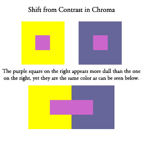 Here is a similar experiment to the one above that illustrates the shift that occurs from a contrast of chroma. |
Contrast in Color Temperature
Placing warm colors next to cool colors can influence each other as well. Warm colors include orange, yellows, reds, and browns (warm grays). Cool colors include blues, greens, violets and cool grays. Cool colors tend to recede and warm colors tend to advance. This affect is increased when one is surrounded by the other.
This is just a very brief overview as it is a complex topic. I'd suggest delving into a book or some of the web sites I'll provide at the end of the tutorial for more information on this.
Color Descriptors | Tutorial Index | Color Schemes