An Introduction to Color Theory
Note: It is important to note that dealing with color on the computer screen is quite different than dealing with it in paint, markers, crayons, pastels, pencils etc. There is a limit to the number of colors that can be represented accuratly on a computer monitor and each monitor will desplay colors differently. On that note, please do not take these graphics as the definitive in color theory, but rather as a crude example that is not real accurate in the world of artistic mediums. I hope you find these examples helpful to you in understanding color and how to use it.
Color Descriptors
Now, you look at the color wheel below and say to yourself "wait a minute, there are way more than 12 colors! I have 144 different colors in colored pencils alone and those don't even match the 144 colors I have of markers or the 96 colors of crayons in Bobby's box!" This is where we get into the additional descriptors of colors. The 12 colors in fig3.jpg represent the "pure" basic colors. You can continue to add neighbors in equal amounts infinite times, or you can also add black or white. Before we get into too much detail on the "other" colors though, there is some basic terminology we need to understand.
 There are many more than 12 colors of paints, crayons, colored pencils or markers available on the market. The additional colors come in through the understanding of color descriptors. |
Hue describes the characteristic of a color or the wavelength that is being emitted. It is what differentiates red from violet and so on. Each hue can be mixed with black or white to yield various tones. The full spectrum from white with the tiniest bit of a particular hue, through the pure hue and onto black with just the tiniest bit of the hue is often called a tonal family.
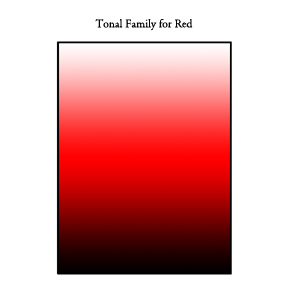 When mixing a color with white or black you achieve hues. The spectrum of these hues is called a tonal family. |
The purest hue (that closest to one of the 12 colors in the tertiary color wheel shown at the top of the page) has a high chromaticity. A high chromatic color has little to no evidence of white, black or gray mixing in it. So with respect to the tonal families, the highest chromaticity color would be in the center of the spectrum. If a color has no hue it is without chroma or color and thus is part of the black tonal family that ranges from white, through gray to black. If white is added to a pure hue the result is a tint. If black is added to a pure hue the result is a shade and if gray is added to a hue the result is varying tones.
The intensity of a color, or saturation is a measure of how much a color differs from gray. So, colors that are made from mixing complimentary colors in equal portions are less saturated or less intense than those mixed more heavily with a given color or mixed from non-complimentary colors.
 Pure colors have a high saturation and colors that have been mixed, particulary mixed complimentary colors, have a lower saturation. |
The value of a color is sometimes called brightness. It is a measure of the amount of light emanating from a color. The brighter a color is, the higher it's value. For example, a deep cranberry color has a lower value than a sunshine yellow color.
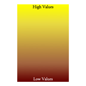 This is an example of values. Notice how the yellow color at the top almost glows, but the dark red at the bottom kind of sinks in and doesn't glow. High values seemingly glow and low values do not. |
Luminance is also sometimes heard when speaking of color, but is much more scientific in its definition. It is a measure of the intensity of light per unit area. This topic is a bit beyond this tutorial, but I wanted you to be aware of what it is. It's tied pretty directly to value as well as to the incident light.
Once you know these terms it's easier to see how the 12 original hues in the color wheel can be adjusted. If we go back to the color wheel, we can add inner and out rings with adjustments to the chromaticity of the 12 hues. In the image below, the inner portion of the wheel shows blacker tones and the outer portion shows whiter tones. Just as you can mix neighbor colors infinite times there are infinite gradations from black through a hue to white. For those of you out there who work with polymer clay, think of the skinner blends - you get a nice smooth gradation between the two colors you mix it's the same thing on a color wheel, both around the wheel and from the center out. If you pick one hue from the main wheel and connect from the center of the wheel straight out to the outer ring you have colors that are part of one tonal family. Those colors that are all the same distance from the center of the wheel will share the same intensity or saturation.
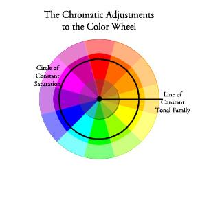 Illustrated here is a circle of constant saturation as well as a like of constant tonal family. |
The next step to using color is understanding how neighboring colors impact each other.
The Color Wheel | Tutorial Index | Color Perception