The Color Series Part III: Color Descriptors II
On Thursday we covered some of the properties of colors we need to have a grasp of so that we may discuss the various ways colors contrast. We covered tones, tints, tonal families, chromaticity, and saturation, with a quick review of hue at the top as well. If you have missed the previous posts in this series I suggest you scroll down to the end and start at the beginning.
Today, I’m going to finish up the color descriptors so that we may move on to looking at the ways in which color can contrast on Thursday. Keep reading for value, luminosity, color temperature, and undertones.
Value
Value is a property of color that more people are comfortable discussing so it is probably familiar territory to most. At the very least more familiar than chromaticity and possibly more familiar than saturation as well.
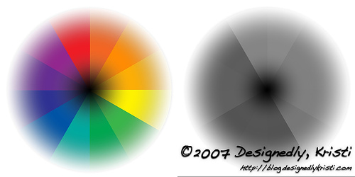
One of the easiest ways to describe value is to call it the perceived lightness or darkness of a color. In reality the hue does not impact the value. Value is measured by comparing a color to gray values. Each hue in the color wheel has a corresponding gray value. So, if you take a colorful photo and turn it into a grayscale image you are comparing the values of the object in that photo. Bright colors and warm colors can be hard to determine the value of, as the intensity of their color can make it hard to judge it appropriately.
There are a few ways to aid you in determining the value of a color. The easiest, but not always the most accurate, is to simply look at colors while squinting. By squinting you are restricting the part of your eye that perceives hue and are thus seeing in near grayscale like an old black and white television. You always have your eyes with you so you do not need to worry about loosing any special tools, which is the advantage to this method. However, once again the warm and/or bright colors can still get through the squint routine and cloud your judgement of value. This is less problematic when judging a monochromatic (using colors from the same tonal family) or analogous (neighboring colors on the color wheel) set of yarns or other types of fibers.
Another option to aid in evaluating value is a tool that is often found in quilt shops and sometimes referred to as a value finder. Most often these tools are a piece of red tinted translucent acrylic that you look through. They also have green versions. Sometimes the quilt shops give them away as key chains for special events. You can also find versions similar to shop safety glasses so you can have both hands free.
Luminosity
Luminance is also sometimes heard when speaking of color, but is much more scientific in its definition. It is a measure of the intensity of light per unit area. This topic is a bit beyond this tutorial, but I wanted you to be aware of what it is. It’s tied pretty directly to value as well as to the incident light.
Color Temperature
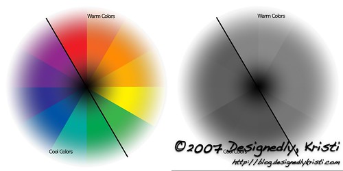
This descriptor should be pretty familiar to most. If you draw a line through the color wheel passing from between red-violet and red to between green and yellow-green, you have the cool colors of red-violet, violet, blue-violet, blue, blue-green, and green on one side of the line. On the other side of the line you have the warm colors or red, red-orange, orange, yellow-orange, yellow, and yellow-green.
When mixing warm and cool colors in a design, the warm colors tend to come forward and the cool colors tend to recede into the background. This is partly due to the fact that in general, the cool colors tend to be of a darker value than the warm colors. Also note that when making tones from the cool colors (see in circle of colors) that the change is more subtle and truer to the original hue when adding black to cool colors. The opposite is true in the warm colors, especially the lighter ones such as yellow and orange which rapidly approach warm neutral tones.
Undertones
So, what about all this talk of cool reds and warm reds? That temperature classification is describing the undertone of a color. An undertone slightly changes our perception of color, but not enough so to move the color to another tonal family.
Only pure light does not have an undertone. All colors on the color wheel can be described with a cool or warm undertone descriptor. An obvious way to observe undertones in our world is to look at a project that has used more than one dye lot. Often the variance in dye lots is due more to a slight difference in the “color” of the natural fiber being dyed. Today with such precise measurement techniques and computer controls the dye bath itself can be mixed very consistently, barring human error such as insufficient rinsing of the vat between batches.
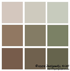 Neutrals can also have undertones. If you can recall the first installment on the colorwheel and neutrals, the graphic (reposted here) shows how the neutrals can have undertones of the dominant color in the mix.
Much of today’s information should be a bit of review. So, the plan at the moment is to be back with another installment at the usual time on Thursday. We’ll be looking at how neighboring colors can influence our color perception and ways in which colors can contrast in addition to hue contrast.