Fiber Fool

Follow the feats and foibles of a fiber fanatic.

Meet Masala…

Filed under: Knitting, Knitting Patterns, Designing, Color — Kristi at 3:33 am on Thursday, April 7, 2011

Masala Slippers

I know a designer having a favorite pattern is like a mom having a favorite child. I know one shouldn’t. Yet I can’t help myself. I’ve been sooo excited to release this pattern out into the world - Masala. There are a number of reasons why, most of which revolve around versatility. It too is part of the latest release of Nourishing Knits.

The colorwork pattern is super flexible. While I went with bold color choices for the samples, one could easily go much more subtle and they would still make an impact. Try a monochrome (two values of the same or similar hues) or analogous (two neighboring colors on the colorwheel) color schemes. No matter your color choices, I do not think you could go wrong. I’m personally itching to do a red and white pair. I think they’ll have a bit of a Scandinavian flare to them. I’m also kind of wanting to do a monochrome pair of taupe tones which I think would have a nice elegance to them.

I love that they fold flat so nicely. It makes them easy to slip into luggage when traveling without the bulk of many commercial slipper options. Plus, the stranded colorwork makes them nearly twice as thick as non-colorwork knitting fabric so there is plenty of warmth. At the same time, they fit into many popular clogs (I forgot to get any pics of that) if you need to duck out for the newspaper or put the trash out on the curb.

Masala Slippers

Masala are also very forgiving in fit. The two samples pictured are almost exactly the same size and they are on a Womens US 7 narrow foot (the blue and gold) and a US 8.5 medium (the plum and gold). They also both fit my US 9.5 medium foot. This ease of fit makes them great gift knitting! If you have the shoe size of your recipient the pattern includes detailed info on determining the total slipper length and a table of shoe size to average foot length to help you.

Also included is a picture diagram and some suggestions on customizing the vamp length - the portion of the slipper knit in the round before you begin toe shaping. The 2″ vamp version (blue and gold) is a bit more secure on the foot and creates a more casual and classic look. The 1″ vamp version (plum and gold) is a bit more trendy. You can choose your own preferred vamp length to suit your tastes and help is included on how to do so.

I need to take a minute to gush about the yarn though. Both samples were knit from Quince & Co’s Chickadee, their sport weight wool yarn. This yarn is fabulous! A new favorite. If you haven’t worked with it, I highly recommend ordering two skeins to knit these slippers. It is a super squishy yarn, making it possible to really crank down the gauge for maximum life on the slippers. It is plied well so there is no splitting while knitting. It holds up to multiple froggings without showing signs of wear.

The magic occurs after washing though - the stitches evened out so beautifully and the fabric developed a lovely hand, even with a very sturdy gauge. Plus, no bleeding whatsoever! Even with colors that are often troublemakers like the blue and plum. Another plus for those of us in the US is that is 100% US made too! I will definitely be working with more Quince & Co in the future.

These are just a few color combos from Quince & Co that I’m considering. The possibilities are endless. The more I think about it, I think a monochrome pair using Leek and Marsh would be lovely too. Someone stop me! I need to finish the rest of the book first! But I think there may be Masala slippers all around for the 2011 Holidays. Once you get the hang of it, they are a really quick knit and there is no finishing other than weaving in ends!

I do have a few surprises up my sleeve for those who have subscribed to Nourishing Knits before the final installment. So if you’ve been teetering on the edge, I’d suggest doing so soon to be included in the special goodies :-)

Nourishing Knits Special Subscription Rate of $16 - buy now

Color Series IV: Contrasts and Perception

Filed under: Tutorials, Color — Kristi at 8:14 am on Tuesday, October 23, 2007

Three weeks ago we covered the last of the color descriptors. If you missed the two color descriptor installments or think you may need a refresher, please check them out before continuing. We all need to be on the same page on how to describe colors so we can better discuss color combinations. Today we’ll look at the different ways colors can contrast.

Contrast

Contrast is often defined as “the state of being strikingly different from something else.” Now, if I told you that the color palette you chose for your fair isle sweater was nice, but lacked contrast what would be your first instinct to fix it? Chances are you would choose a darker version of the darkest color or a lighter version of the lightest color or both. When people discuss contrast with no further qualifiers it is most often in reference to value. That is one of the strongest forms of contrast since that is the characteristic of a color that we can perceive from the greatest distance. However, that is only one of many ways colors can contrast with each other. A richer or more dynamic color palette can be created by incorporating other forms of contrast in a color scheme.

Contrast in Saturation and by Default Value

Thinking back to the previous installment, saturation is a measure of the pureness of a hue. When we tint or tone a color we are changing its saturation and value. So, a contrast in saturation is also a contrast in value. This is one of the easier contrasts for us to evaluate because our visual experience is dominated by value.

Value Contrast and PerceptionWhen we explore three colors that are identical in all areas except saturation we find an interesting shift takes place. If you take the middle saturation color and place it in the center of a light and dark saturation you see the middle one looks like two different colors. In the image at left we see the effect on a neutral gray, removing the complications of hue it is a look at just value contrast. The smaller middle square is the same in both larger squares, but the one in the darker large square appears lighter than the one in the lighter large square. On the bottom of the graphic, you can see the middle gray is indeed the same shade, no matter what your eyes and brain tell you.

Saturation Contrast and PerceptionIn this image (right) you can see it also happens when hues are involved. If you vary the tonal family in the example you end up introducing other forms of contrast, hence this simplistic demonstration. You should experience a similar effect as you did with the gray boxes.

Contrast of Hue

The highest contrast of hues is formed by complimentary colors. If you recall, the complimentary colors are directly opposite on the color wheel. Some examples include blue and orange, green and red, violet and yellow etc. If you don’t have a color wheel handy an easy way to determine the complimentary color is to stare at the color for at least 20 seconds and then look at a white area. Because of the way the light interacts with the rods and cones in our eyes you see what is called an after effect on the white that happens to be the opposite color. Give it a try!

While complementary colors add a lot of energy to an object, when you place equal amounts of complimentary colors which are of the same saturation and tone etc. next to each other there can often be an unsettling feeling. This can often be used effectively in visual art to help convey the feeling of the piece, however in usable/wearable fiber arts I suspect that is not often a desired outcome. In the image below, look at the left side of the central boxes and notice how that line between the orange and blue kind of vibrates?

Hue Contrast

This effect can be reduced in a variety of ways. The easiest way to reduce the uneasiness is to use unequal proportions of the complementary colors. Contrasting the two colors in other areas as well by choosing different saturations for example can also be quite effective; think of the pink and green color combo that has been popular. If the complimentary colors are broken up with a neutral like black, brown, or white, the energy of the complementary colors combo remains, but is more pleasant to an observer. See how the vibration is greatly reduce when you look at the right side of the central boxes above?

The complementary colors can also serve to help your design pop. If you are working an intarsia design and the background color and the design color are not contrasting enough, you can make the intarsia stand out better by outlining that section with its complementary color.

Contrast in Chromaticity

Chroma Contrast and PerceptionJust as we saw with contrast in saturation, when surrounded by another chromaticity, the perceived color characteristics can be tilted towards the opposite of those in the surrounding color. For example, a bright vibrant color around a medium chromaticity color will make that medium color appear duller (left). The opposite is also true. If a dull, low chromaticity color surrounds a medium one, that medium one will appear more vibrant than when viewed alone (right). Again, if you need to, use a white sheet of paper to cover half of the graphic.

Contrast in Temperature

You may have at this point noticed a trend in the contrasts. The surrounding color enhances the opposite trait(s) of the color it surrounds. A darker color makes a lighter color appear even lighter than it does on it’s own. A duller color makes a brighter color appear even brighter. The same holds true with contrasts in color temperature or undertones. This is most notable when the middle color is one on the line between warm and cool colors.

Temperature Contrast and PerceptionIn the graphics at right, notice how the red-violet appears cooler when surrounded by the warmer red and appears warmer when surrounded by the cooler blue. This form of contrast is also sometimes referred to as simultaneous contrast, depending upon your source for color theory information.

Conclusion

When working with yarn we don’t have the luxury of an unlimited color palette unless we are dyeing our own, so often we’re not going to be able to work with only one of these forms of color contrast. That is okay. It is just important to be aware of the different ways in which a color can contrast with those around it so you can better evaluate what you like or dislike about a given color combination. You can also use these perceptions to adjust how a color in your design is perceived.

Additional Posts in the Color Series

Color Projects Around Here…

Filed under: Spinning, Color — Kristi at 10:57 am on Thursday, October 4, 2007

Autumn Fiber Project

I know I said in Tuesday’s post that I would be back today with the real meat of the color series. I lied. Actually, blame Emma. Yes, poor sweet Emma. See, on Tuesday night she insisted on waking me up after only three hours of sleep. I was awake though and couldn’t fall back to sleep so I moved to the guest room where I did a little bit of work and then tried to fall asleep watching Gilmore Girls on DVD. I finally fell asleep and 30 minutes later, when Drew got in the shower she decided to open the guest room door which made light from the bedroom flood in and gave her access to lick to my feet and hands. So, yesterday I was running on 3.5 hours of sleep. Apparently I am much, much too old for that. I was clutsy, my eyes burned all day and I literally found myself nodding off while knitting. Given those signs I decided it was best to not try make the numerous graphics required for the next color series installment. I also figured any writing I did would be unintelligible to a well-rested mind.

Here it is a bit after 10am and I got nearly 12 hours of sleep, with only the tiniest of interruptions when Emma was fed and let out and coaxed back in this morning. I vaguely recall hearing Drew give her a talking to about letting me sleep and she must have taken it to heart because I heard not a peep out of her, nor did I get a cold nose sneaking beneath the blankets. I’m feeling much better today so I will be working on that post, but it likely won’t get posted until next week as we have a busy weekend coming up.

Color and Fiber Blending all in One!In its stead I decided to give you a peak of some of the color I’ve been working with lately. At the top and to the right is some wool (green) and bamboo (gold and espresso) top that I am playing with mixing. I’m trying out different proportions of the colors on handcards so I can work with just a little at a time. It’s a bit of struggle because my postal scale is very coarse and only measures grams in 3 gram increments. But I think I’m getting close to the final proportions I wanted to test for. I have two version fully carded, one of which is awaiting Navajo plying so I can see what it looks like in a 3-ply. The other needs spun. Then I think I also want to card and spin up a bit of the green plain as a test to see how the bamboo has changed the drape and sheen of the final yarn and I think I want to try one with less than 40% bamboo too.

I keep running into references that less than 50% silk in a blend and you can’t see it and I want to see if that is true with the bamboo as well. I’m thinking one could use less because it seems to have a much higher sheen. That, and if you are also color blending at the same time I think that may also help the shininess of the bamboo pop - at least with colors that are lighter than the base color.

Six Color Blended Batts

I was supposed to meet up with Cathy (get well soon!) on Tuesday to return the drum carder to her so she could do some of her own blending, so over the weekend I had decided I’d like to quickly try pop out some drum carded rolags for spinning self-striping yarn. There was an article in the latest (Fall 1007) issue of Spin-Off by Diane Cutler. The article was not very detailed so it was more of a jumping off point. I did mistakenly only make 6 rolags with 2 per ply with the intention of making a 3-ply sock yarn. However, each rolag only has about 7 stripes in it. I should have made 12 rolags so I had 2 per ply for a 3-ply for each sock, or doubled the stripes on the carder, but I think that would have gotten to muddy. Seven stripes felt as though it was pushing it. If I make socks from the yarn spun from these rolags I’m going to have very broad color changes, with only about 7 stripes per sock. :-/ I may have to rethink the use. A BSJ would work nicely, except I didn’t use superwash and I know of no one (even knitters) would would appreciate a non-washable baby garment. I suppose a BSJ could be wall art, huh? Don’t worry Drew, I wouldn’t do that to you. I’m a long way off from spinning this project up though so we’ll see what the final yarn looks like before I make any rash decisions.

36 Little Balls of Fluff

I did take step-by-step photos so once I have finished the yarn and at least a swatch I’ll be able to do a tutorial on how I did it. I’m pretty booked for deadline stuff from now through the holidays though so don’t hold your breath while you are waiting. We’d miss your presence here. In all seriousness I suspect it will be after the new year until I get to post that.

So, that is the state of color in my world of WIPs at the moment. Well, that and my Norwegian Boatneck whose final color scheme I haven’t revealed yet. I will soon though! Oh, and the socks from Deb’s yarn are nearing completion. They could possibly be done yet today, but certainly by Monday.

What is your current state of color right now?

The Color Series Part III: Color Descriptors II

Filed under: Tutorials, Color — Kristi at 9:30 am on Tuesday, October 2, 2007

On Thursday we covered some of the properties of colors we need to have a grasp of so that we may discuss the various ways colors contrast. We covered tones, tints, tonal families, chromaticity, and saturation, with a quick review of hue at the top as well. If you have missed the previous posts in this series I suggest you scroll down to the end and start at the beginning.

Today, I’m going to finish up the color descriptors so that we may move on to looking at the ways in which color can contrast on Thursday. Keep reading for value, luminosity, color temperature, and undertones.

Value

Value is a property of color that more people are comfortable discussing so it is probably familiar territory to most. At the very least more familiar than chromaticity and possibly more familiar than saturation as well.

The Colorwheel and Value

One of the easiest ways to describe value is to call it the perceived lightness or darkness of a color. In reality the hue does not impact the value. Value is measured by comparing a color to gray values. Each hue in the color wheel has a corresponding gray value. So, if you take a colorful photo and turn it into a grayscale image you are comparing the values of the object in that photo. Bright colors and warm colors can be hard to determine the value of, as the intensity of their color can make it hard to judge it appropriately.

There are a few ways to aid you in determining the value of a color. The easiest, but not always the most accurate, is to simply look at colors while squinting. By squinting you are restricting the part of your eye that perceives hue and are thus seeing in near grayscale like an old black and white television. You always have your eyes with you so you do not need to worry about loosing any special tools, which is the advantage to this method. However, once again the warm and/or bright colors can still get through the squint routine and cloud your judgement of value. This is less problematic when judging a monochromatic (using colors from the same tonal family) or analogous (neighboring colors on the color wheel) set of yarns or other types of fibers.

Another option to aid in evaluating value is a tool that is often found in quilt shops and sometimes referred to as a value finder. Most often these tools are a piece of red tinted translucent acrylic that you look through. They also have green versions. Sometimes the quilt shops give them away as key chains for special events. You can also find versions similar to shop safety glasses so you can have both hands free.

Luminosity

Luminance is also sometimes heard when speaking of color, but is much more scientific in its definition. It is a measure of the intensity of light per unit area. This topic is a bit beyond this tutorial, but I wanted you to be aware of what it is. It’s tied pretty directly to value as well as to the incident light.

Color Temperature

Color, Value and Temperature

This descriptor should be pretty familiar to most. If you draw a line through the color wheel passing from between red-violet and red to between green and yellow-green, you have the cool colors of red-violet, violet, blue-violet, blue, blue-green, and green on one side of the line. On the other side of the line you have the warm colors or red, red-orange, orange, yellow-orange, yellow, and yellow-green.

When mixing warm and cool colors in a design, the warm colors tend to come forward and the cool colors tend to recede into the background. This is partly due to the fact that in general, the cool colors tend to be of a darker value than the warm colors. Also note that when making tones from the cool colors (see in circle of colors) that the change is more subtle and truer to the original hue when adding black to cool colors. The opposite is true in the warm colors, especially the lighter ones such as yellow and orange which rapidly approach warm neutral tones.

Undertones

So, what about all this talk of cool reds and warm reds? That temperature classification is describing the undertone of a color. An undertone slightly changes our perception of color, but not enough so to move the color to another tonal family.

Only pure light does not have an undertone. All colors on the color wheel can be described with a cool or warm undertone descriptor. An obvious way to observe undertones in our world is to look at a project that has used more than one dye lot. Often the variance in dye lots is due more to a slight difference in the “color” of the natural fiber being dyed. Today with such precise measurement techniques and computer controls the dye bath itself can be mixed very consistently, barring human error such as insufficient rinsing of the vat between batches.

Sampled Neutrals from Red-Green MixingNeutrals can also have undertones. If you can recall the first installment on the colorwheel and neutrals, the graphic (reposted here) shows how the neutrals can have undertones of the dominant color in the mix.

Much of today’s information should be a bit of review. So, the plan at the moment is to be back with another installment at the usual time on Thursday. We’ll be looking at how neighboring colors can influence our color perception and ways in which colors can contrast in addition to hue contrast.

Additional Posts in the Color Series

The Color Series Part II: Color Descriptors I

Filed under: Tutorials, Color — Kristi at 8:39 am on Thursday, September 27, 2007

Last week we learned a bit about the color wheel, how neutral colors are made when working with paint, and defined hue. If you missed it, check out Hue and the Color Wheel.

When using multiple colors in knitting and other fiber arts it most often comes down to contrast and in what way you wish the yarns/fibers/fabrics to contrast. In order for us all to be on the same page when discussing color harmonies and how they contrast we need to have a good grasp of the various ways in which to describe color. So, in this installment I will be defining a few of the common color descriptors with a few more to follow early next week.

Hue

Hue was defined in the previous installment, but it is very important to understand it so as a refresher, hue describes a range of wavelengths being emitted or reflected by an object. It is what differentiates each of the colors on the color wheel. Hue is described by the color name, though it is most often described by a general color family. Colors we refer to as candy apple red, sky blue and sea green, for example are not hues. Remove the descriptors of candy apple, sky, and sea and you are left with their hues of red, blue, and green. Hues usually are described with no more detail than the tertiary colors and more often just the secondary colors.

Tones, Tints and Tonal Families

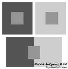
If you take a color and add white to it to lighten it you have a what is referred to as a tint (bottom of the graphic below). All those nice, light pastels everyone loves dressing babies in are tints. Pink, baby blue, pale yellow, peach, etc. are examples of tints.

If you take a color and add black or gray to it we often say we are “toning it down.” Colors that are darkened by the addition of black or gray are called tones (top of the graphic below). So, if you look at the forecasted fashion colors for this season you will see there are many tones in that palette, especially those for women.

Red Tonal Family
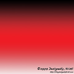
If you were to take a slice out of the color wheel and look at the gradations from the darkest tone, through the pure hue to the lightest pastel version you have what is called a tonal family. When we discuss color harmonies in the coming weeks the entire tonal family can be chosen from and still fit within a specific color harmony. In fact, one of the best ways to mix red and green and not get that stereotypical “Christmas” feel is to use different tones and tints of the two colors, such as a very dark green and a medium or light pink. It is still a red-green color combo, but by mixing up the tones and tints used you end up with a very different feel.

Chromaticity

Chromaticity
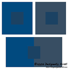
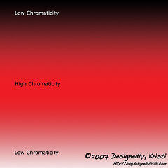
Chromaticity and saturation are ways in which we describe the pureness of a hue. Take a look at the tonal family. If you look at the color in the center of that graphic you see a red that is similar in qualities to those seen on the color wheels of the previous color post. It has no tint (whiteness) or tone (black/grayness). That color has a high chromaticity. The higher the chromaticity of a color, the closer it is to a pure hue.

No Chromaticity vs Low Chromaticity
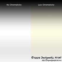
Why are tints and tones lower in chromaticity? Because if a hue has no chroma (the Greek word for color) it is a truly neutral white, gray or black. The range from black to white with no hue is the black tonal family. The black tonal family has the lowest chromaticity possible – none. Add in just a tiny bit of yellow to make the white more ivory and warm up the black slightly and there is chromaticity. Not much, but some.

Saturation

Those who have worked with mixing paints or dyes knows that adding white or black to the paint (or lowering the concentration of dye) is not the only way to make a color appear slightly “muddied.” A more complex and visually interesting way to create a duller appearing color is to add some of the complementary color – just as we did to make the neutrals last week, only often you tip the scales further towards one color of the complementary color pairs.

Yes, I did just say that one could make a more complex and visually interesting dull color. It may not sound possible, but if you are a multi-crafter or have kids and you have paint around, take two tubes – one color from each side of the color wheel (red and green, or blue and orange, or violet and yellow) and start working a titch of one color into the other. Keep tipping the scales until you get to a nearly 50/50 mix. All throughout the mixing process, no matter the ration of one color to the other, the resulting color has a bevy of undertones to it, yes?

Color Mixing and Saturation
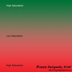
Technically speaking, saturation is the measure of how far a color is from gray. Sometimes this is referred to as intensity of a color. Colors mixed with their complementary colors move closer towards a neutral gray the closer to equal parts of each color and thus become lower saturation. Colors that are purer in hue are of higher saturation. Colors that are mixed with neighboring (analogous) colors are of higher saturation than those mixed with colors across the color wheel. The tones of a color are also lower in saturation.

So, in the paint experiment described above, you will be lowering the saturation of the paint color each time you add more of the complementary (see graphic at right). At least until you achieve the 50/50 ratio. If you keep adding the complementary color beyond that mark you are tilting the scale of the color towards the color you are adding and thus raising the saturation. Say we are working with red and green. You start with red and keep adding more green until you have a neutral color. During that stage you are decreasing the saturation. If you continue to add more green and turn the neutral towards the green side you are increasing the saturation each time you add more green to the mix.

Once again, the closer a color is to its pure hue, the higher the saturation of the color. If the color is nearer to the neutral that is made by mixing it with its complementary it is a low saturation color. Often such low saturation colors are described as muddy or dull.

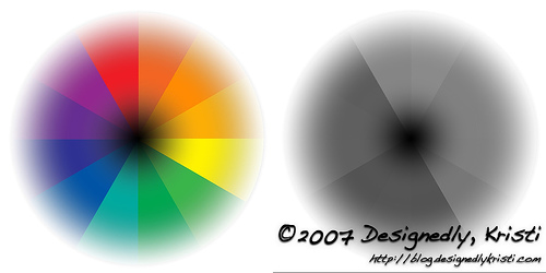
Putting Chromaticity, Saturation and Tonal Families on a Color Wheel

Tonal Color Wheel 
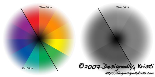
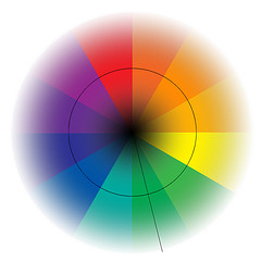
Just as you can mix neighboring colors infinite times and have an infinite set of colors or hues, you can have an infinite set of colors in a tonal family. The color wheel to the left shows the tertiary color wheel from the previous post with a tonal family overlay. The tones are at the center of the wheel and the tints on the outside.

You may notice a black circle cutting through the middle of the colorwheel. That is a line of constant chromaticity and saturation, marking the areas of purest hue. If you gave that circle a larger diameter is would still be a line of constant chromaticity and saturation (as long as it is centered on the wheel), they would just have different measures if the diameter of that circle were changed.

There is another line on that color wheel. One that moves straight out from the center of the color wheel through the center of the green section. This is a line marking a constant tonal family. In this case, it marks the green tonal family. Any color sampled along that line would be a part of the same tonal family.

Conclusion

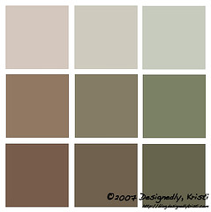
So, those who read Margene’s post yesterday may have noted that she prefers purer colors. Another way to put that is to say she prefers high chromaticity and high saturation colors. If we look again at the forecasted colors for this coming season, the women’s colors especially fall into the category of low saturation and low chromaticity.

This has gotten a bit long. Color is easier learned about in small chunks and thought about and applied for a bit before moving on. So I’ll stop here for today and have the rest of the color descriptors early next week for you. While you await the remaining color descriptors, I suggestion observing the colors you come across in your day and analyzing them for saturation and chromaticity as well as identifying what tonal family they would be a part of. If they have lower chromaticity, are they tones or tints? Or, are they dulled by the addition of their complementary color?

Once again, if you have questions, please do not be shy, leave a comment!

Additional Posts in the Color Series

Next Page »