The Color Series Part I: Hue and the Color Wheel
 Color, in the scientific sense is a property of an object to reflect light at certain wavelengths. However, color plays such a large roll in our daily perceptions that the word has come to have many other meanings outside of just describing the appearance of something. Case in point? It is not unusual to talk about the “color of music” of speak of a “colorful character” (and not just in reference to how that person dresses).
 Color is a *very* large part of our daily lives, even if you do not go around taking notes of striking color combinations you see on a billboard sign or in a garden in your neighborhood. It means color is also a very personal thing. While we may go through phases in our color tastes (often impacted at least in part by current fashion and decor trends), in general those who know us can often peg our tastes quite accurately. Color in our knitting (and other crafting as well) can be a great way for us to express ourselves, but choosing colors from a nearly unlimited palette, a less than ideal palette, or changing the color scheme of a published design can be intimidating. On the opposite side, just because we are comfortable with a certain color combination doesn’t mean it is the best choice for every type of project.
Because this is primarily a knitting/spinning blog I’m going to address some issues of color over the next few weeks or so from the point of view of knitting. To do so it is important that we are all on the same page when describing color. So, first up is a brief intro to the vocabulary of color, starting with hue.
Hue
Hue describes the characteristic of a color or the wavelength that is being emitted. It is what differentiates red from violet and so on. It is described by the color name. Fancy names such as olive or cranberry are not hues, however. They are descriptors for more complex colors that are not just a pure hue. If you added the color family name onto those colors you would then be identifying the hue. For example, take olive green – it is a form of a green hue. The same goes for cranberry red – it is a form of a red hue. Hues usually are described with no more detail than the tertiary colors (defined below) and more often the secondary colors (also defined below).
Primary Colors
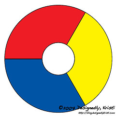
As the name implies, the color wheel is a continuous wheel of color. It starts out with the three primary colors. Primary colors are colors that cannot be made by mixing other colors together, but instead can be mixed in varying proportions to create any of the other non-primary colors. The three primary colors are red, yellow and blue.
Secondary Colors
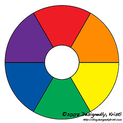
The secondary colors are those made by mixing neighboring primary colors in equal amounts. These will fill out the color wheel to match what we as kids considered the “rainbow colors.” The three secondary colors are orange, green, and violet.
Tertiary Colors
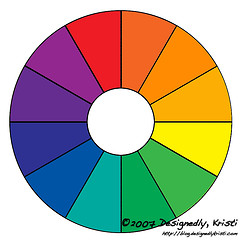
There are six tertiary colors made by mixing the neighboring primary colors in unequal amounts. This means each of the three secondary colors can lean more in either direction. The names are described with the dominant primary color listed before the secondary color it resembles. The six tertiary colors are red-orange, yellow-orange, yellow-green, blue-green, blue-violet (sometimes called purple), and red-violet.
The Neutrals
You will notice that these rudimentary color wheels have no neutrals in them. There is no black, white, gray, tan, or brown. Well, those are more complex colors. When you are talking about a white object, it means it is reflecting all light. A black object is the opposite – it absorbs all light and reflects none. It gets even more complex when you look at it in terms of mixing paint. Obviously you can’t mix white from other colors and often when you try to mix black you end up with some form of brown.
Browns and grays are tricky as well. Brown is usually made by mixing equal parts of the three primary colors or alternately by mixing a primary with it’s complementary secondary color (the colors directly opposite on the color wheel), this leads to a wide range of browns that can be either cool or warm in their appearance. Each of the circles in the graphic above had a 5 px average color sample taken and was placed into the grid of the graphic below. Notice how the “browns” on the left are warm and move towards cooler “browns” on the right.
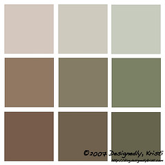
Grays are usually just a toned version of black. If black is made by mixing it can be warm or cool depending on the ratios of all the colors being mixed. It is often harder to judge that in black, but once you tone the black down into a gray it is easily seen to be a warm or a cool gray just as we saw with the “browns” above.
——-
If some of the descriptions in this first post were intimidating, don’t worry I’ll be covering them in the next installment. Don’t be shy about asking questions. I’ll e-mail you back or answer your questions in the follow-up posts. If this post was all familiar to you keep checking back as it will taking a more knitting-centric view as we progress.
Studying color on the computer is not ideal as everyone’s monitor will display colors differently. This is also what makes it so hard to choose yarn on-line for a project. Access to a functioning color wheel will come in handy as the series progresses. Many color wheels are set up to help you mix color, but if you can locate one that does not focus on that you may find it a bit easier to use for knit design. My favorite color wheel is by EK Success, which comes in a size small enough to keep in your knitting bag and contains some helpful hints in identifying some of the classic color harmonies. There is also a good color wheel and template overlays available as part of Color Works by Deb Menz if you can locate a copy.
Coming up next? Tonal families, chromaticity, color temperature, value, saturation and more!