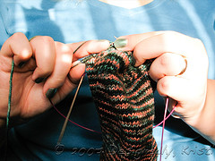
Socktoberfest: Yarn Review 2007A
If you were around last year for Socktoberfest you know doubt recall a sock yarn review I did. If you weren’t around then, go check it out, I suspect you’ll find it useful. Today, the last day of Socktober, I am giving you part one of the 2007 yarn review. Since most of the sock yarns I’ve used this year haven’t experienced much wear yet the review will be mostly on how it was to work with and how it washed up with my usual method of hand knit sock washing - cold water, gentle cycle in a front loading washer, in a lingerie bag, and hung on a drying rack.
Tomorrow, or perhaps next week (seeing as how I was plagued with headaches all day yesterday) I’ll be ringing in with a report on some yarns I haven’t worked with or haven’t been able to witness durability on. A friend has kindly allowed for me to photograph the wear and tear on the socks she’s knit in the last several years. So there will be a belated part two to look forward to.
Since last Socktober I have worked with Lana Grossa Meilenweit Mega Boot Stretch Softcolor, Dale Baby Ull, Fleece Artist Sea Wool, Knit Picks Gloss, Regia Silk, Crystal Palace Panda Wool, Brown Sheep Wildfoote, and currently Bonker’s Superwash Merino Mini.
Mega Boot Stretch Softcolor
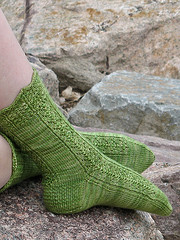
 Meilenweit Mega Boot Stretch Softcolor (Ravelry) is a gentle ombre striping fingering weight yarn of 70 % superwash wool, 23 % polyamide, 7 % elité (some sources list as elastic). You get 366 yards from a 100 gm ball, which should yield an average adult pair of socks. I knit a knee high version of Balance socks from it this time last year and used more than one ball, but significantly less than the two I purchased. It retails for around $18 a ball, so it is about average priced for dedicated sock yarn.
Knitting with Mega Boot Stretch was pretty nice. I did not notice the elastic content. In fact, I recall thinking it was a bit inelastic. Though now that it is knit up there is definitely some extra bounce back to the sock, which is a great asset in a knee high. It is not plied very tightly, so it is a bit splitty which can be a bit problematic when doing increases, decreases and twisted stitches as in this sock. It was not so splitty that I wouldn’t knit with it again. But it is not a good yarn choice for poor lighting or inattentive knitting. If I ran across a colorway that really spoke to me I wouldn’t hesitate to purchase it, though I wouldn’t go out of my way to locate a source either.
The knee highs were worn quite regularly during the winter last year and so far there are no real signs of wear. They fluffed slightly with the first washing, but no pilling or felting is evident at this time. That said, for whatever reason I am not very hard on my socks. It even takes me several years to wear out cheap commercial socks. Your mileage may vary.
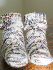
Dale Baby Ull
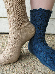
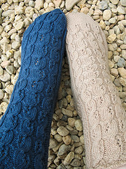
 These socks at left were knit from Dale Baby Ull (on Ravelry)which Kristen dyed for the Dye-O-Rama swap back in 2006. It is a fingering weight 100% superwash wool from the Norwegian yarn company, Dale. It is put up in 180 yd/50 gm balls, so two balls are required for an average pair of adult socks. A ball retails for $6-$7 making a pair of socks costing roughly $12-$14, making it a quite affordable sock yarn.
The yarn was fantastic to knit with. Baby Ull is the softest superwash I’ve worked with so it was fantastic to knit with. It is also quite elastic and resulted in a very nicely cushioned sock. I completed these socks in January so they too have received a fair bit of wear and washing. They look as new as when they came off the needles on the top of the foot and leg, with just a slight look of fuzziness on the bottom of the foot. The only drawback I see is that the color palette favors baby knitting. But, my understanding is that it was just as nice to work with for dyeing so I may go that route myself in the future.
Fleece Artist Sea Wool
 Fleece Artist Sea Wool (on Ravelry) is 70% merino wool and 30% seacell, a sea weed derived fiber purported to have anti-bacterial and anti-microbial properties and a sheen like silk. I knit my Siren Socks from the Moss colorway in late spring. It is put up in 115 gm hanks containing roughly 380 yards and retails for about $25 US, so it is at the higher price spectrum for a pair of socks.
My personal experience knitting with it was fantastic. It is very soft and smooth. Some might find it a bit too slippery for metal needles, though I experiences no problems knitting on turbos with it. There were occasional and very small areas where the seacell didn’t draft smoothly into the machines so there was a small blip that was unnoticeable in the final sock. I do know others have run across much larger versions of that and/or knots, though that wasn’t my experience with the yarn. It is very soft and moderately plied so there were no troubles with splitting the yarn. The color sections appear quite short so I experienced no noticeable pooling or flashing, which is a huge bonus in my book.
My socks were completed in late spring and then had to await their photo shoot until September when I could release the pattern on my web site so they have only had a little wear. They appear to have withstood my normal washing methods unscathed and that are quite comfortable to wear.
Knit Picks Gloss
 Knit Picks Gloss (on Ravelry) is a 70% merino and 30% silk fingering weight yarn sold in 50 gm balls containing 220 yards for $4 a ball. An average pair of adult socks will require two balls for a total cost of $8, definitely at the cheapest end of the sock yarn scale. I knit the dark blue version of Mashup Madness from this yarn in the Dusk colorway.
While I completed the first sock knit from Gloss in late 2006, it has seen no wear or the normal washing. I was slightly disappointed in how the darkness of the yarn swallowed up the pattern of the sock, so when I knit sock number two I used the yarn listed next. So far, neither sock has a mate because I tired of the pattern after two socks in row. I should get back to that. The knitting of Gloss was fine. In my opinion I prefer my sock yarn to be plied a bit more, but it wasn’t terribly splitty and did not require extra attention to knit with. The silk content gave it a nice sheen and slickness, but not so much so that I had any troubles knitting it on turbos.
Regia Silk
 With 55% wool, 25% nylon, and 20% silk, these 218 yds/50 gm balls of Regia Silk (on Ravelry) cost about $9 or $18 for an average pair of adult socks.
Again, I knit only one Mashup Madness Sock from this yarn. So, I an unable to report on the washing and wear of the yarn. Knitting with it was not a pleasure. My one ball used for my sock contained two very large blobs of fiber where the nylon and/or silk didn’t’ draft evenly into the spinning equipment. It made me very mad, as I do not understand how a blob of fiber the size of a marble in a fingering weight yarn could pass through the entire mill process without clogging equipment and end up in my ball of yarn. Nevermind how two of those blobs could! I got no response from the company when I shared the photo I had of one of those blobs.
Aside from the monster blobs, knitting with the Regia Silk was very similar to knitting with the Knit Picks Gloss. Though the nylon content of Regia Silk in theory should give the yarn higher durability, especially for socks, I would think twice before buying Regia Silk again. It is one thing to pay rock bottom prices and run into yarn in that poor of condition, but when I pay $9 for only 218 yards I expect it to be good yarn. I understand that yarn doesn’t go through a mill without a break or a jam here or there. However, I am not fan of doing business with a company that does not acknowledge a complaint let alone make things right when there is a mistake.
Panda Wool
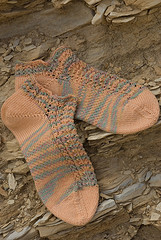 At 170 yards per 50 gm ball, Crystal Palace’s Panda Wool (on Ravelry) yarn is a blend of 46% bamboo, 43% wool, and 11% nylon that retails for roughly $7.50 or $15 for a two-ball pair of socks. Though adults with larger feet who like tall socks may need a third ball. I knit my Coyote Ridge Anklets from two balls, with a significant amount of the contrast ball remaining.
Despite the high bamboo content, the yarn did not have as much sheen as I would have expected. However, even knit at 9 sts/in the final socks still had an amazing amount of drape to it. It was fantastic to knit with. I was disappointed slightly upon washing them as I got a lot of felting. Though I have to confess that they went through an amazing amount of abuse on their first washing because they got forgotten in the washer. So, I am not comfortable saying that they would normally felt in a single gentle cycle wash in a front loader, though I can say that the only other yarn that also felted when that happened was some indie yarn with a base of Kona Superwash. Yes, I also manage to felt superwash wool. But, almost all of my handknit socks were a part of that wash, so interpret as you wish. I still plan to knit another pair from Panda Wool at some point as I appreciate their efforts to coordinate the solids and prints and it was wonderful to knit with. It will also give me a chance to see if it felts under my normal washing conditions.
Brown Sheep Wildfoote
 Brown Sheep’s Wildfoote Luxury Sock Yarn is put up in 50 gm skeins containing 215 yards of 75% washable wool and 25% nylon. Again, it takes two skeins to get an average pair of adult socks, so that would cost about $12 for a pair.
I just knit two baby sized Archimedes hats and the baby socks I posted about yesterday so I can’t really comment on the durability. Hand washing in the bathroom sink made no difference in the appearance of the knit fabric. Knitting with the Wildfoote is fairly average. It is a bit splitty which only causes problems when doing increases, decreases, or twisted stitches. It is a tad inelastic as well. But, the price is good and the color selection is quite broad. I have lots more in my stash from this year’s spring break trip to the mill so I’ll be knitting with it again and hopefully be able to report on the durability.